History
I'm going to be posting screenshots of previous version of my personal site as far back as I can go in reverse order. It's going to take a while to find all of the old screenshots though.
Carson F. Ball's Tech and Humor Site's Home Page
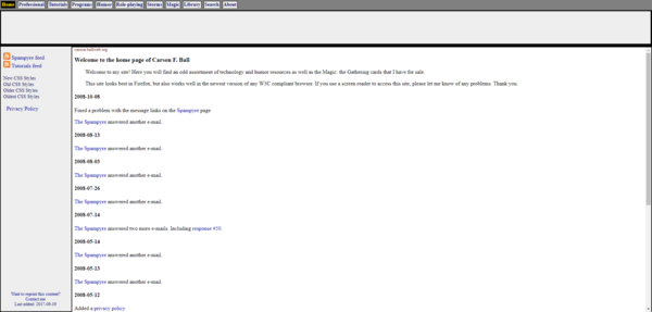
This is my most recent historical site (the one immediately prior to the one you are currently perusing). It was still pretty minimalist, like the last one, but had more styling, better - IMHO - navigation, RSS feeds, and was data-driven instead of being static HTML.
I'm not sure when this site first went up, but the oldest timestamp on any of the files is from 2017. However, I'm pretty sure that's when I switched hosts so that date is unlikely to be correct. IIRC, it is probably more like 2012.
Carson Ball's all-encompassing web site.
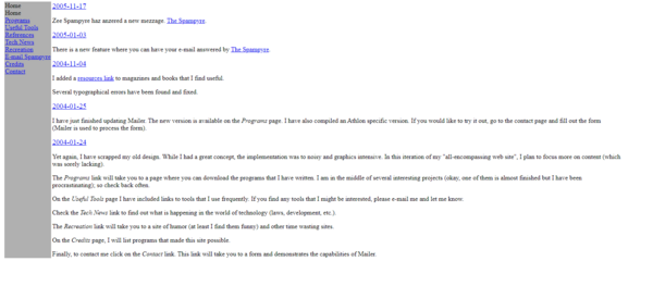
Here is what my site looked like two iterations ago (2005 was the most recent update). I kept the title from the previous iteration. In fairness, it was aptly named.
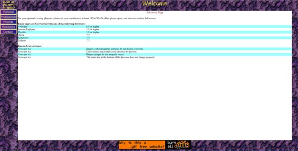
I was rebelling against the excessive use of graphics that people (including me, see below) were prone to in the late 1990s (oh how I hate thoese "Front Page" and "Hot Dog Express" sites. I remember the links on the left-hand side being styled, but the styles no longer seem to work. Or, it's possible that this wasn't pulled from my most recent backup.
Honestly, I didn't intend to stick with this version for as long as I did. It was extremely plain and was really just a place-holder until I decided on a look. I was more focussed on adding content.
Carson Ball's all-encompassing web site.
See what I mean about heavy-handed use of graphics? Also, with that title, it really should have been much more impressive. It's still much better than the travesty that was my first web page (when people had a single, long page, rather than a site. The layout on that site no longer flowed correctly in modern browsers and the GIFs were being interpreted as 320x200 no matter what ImageMagick said their actual size was, so I had to resave everything and use modern styles to recreate a horrible looking site. But, enough about that, you'll see it soon enough if you keep scrolling.
I had forgotten all about some of those old browsers. Konquerer? Galleon? Well, I know what OS I was using back then. Honestly, considering that Netscape 6 was the recommended browser, I'm surprised it rendered so well in Chrome 104.
Oh, and the image at the bottom was actually a rotating banner. This particular image was protesting against GIFs being non-free to use and recommending PNGs instead. To be fair, PNGs usually are much smaller anyway. Size and, by extension, loading speed was very important back in the day (2003 according to the date of the backup).
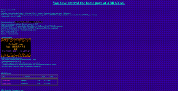
ABRAXAS's home page
Oof, I'm sorry to your eyes and every graphic designer who ever lived. Hell, I should even apologize to Cthulhu cultists at this point; I'm sure this drove them to madness faster than eldrith horrors ever could have.
Unlike the next version of the site that was best viewed in Netscape 6, this site is best not viewed. I have no idea why I thought this was a good idea. My only excuse is that everyone else was doing this kind of crap in the mid and late 1990s as well but that doesn't make it right.
By comparison, my next site was downright pleasant to look at.
I have a couple of friends with different forms of color blindness. I'm considering asking them if they can even read anything on this site. I have an astigmatism in both eyes and it causes me problems for different reasons.
For background: ○ ABRAXAS was my name in the local demo scene. ○ ΣNDVZTRÆL MμZ1K was the name of the demo group I was a part of. ○ GoldFire was a demo that I wrote in x86 Assembly Language. ○ Mod was a music file format.
GoldFire has been ported to Python using OpenGL and runs on modern systems. You can check the software page for more details.
